
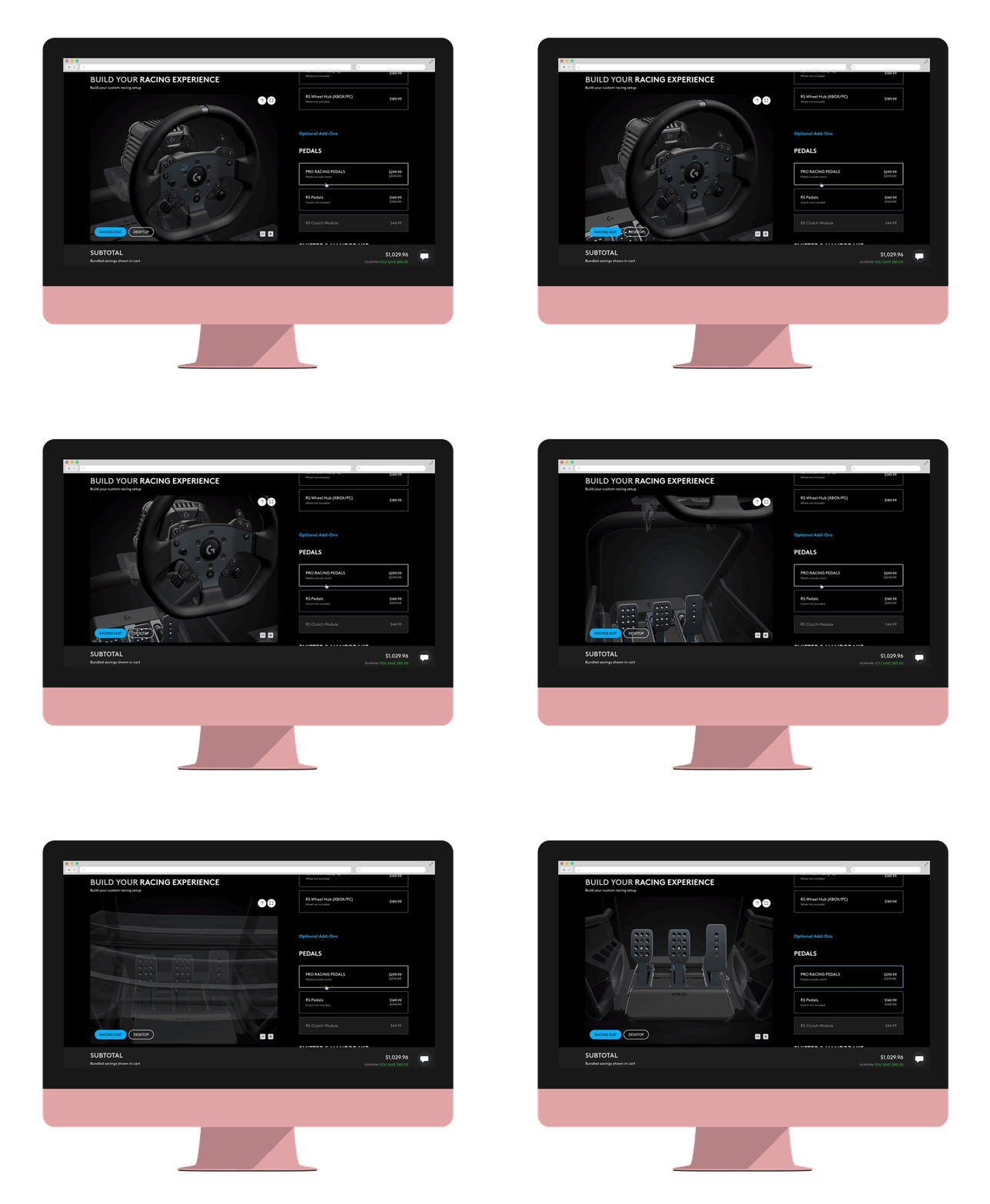
Sim Racing
Configurator
LOGITECH G · E-COMMERCE • 2024-2026
Sim racing gear is a system, not a product — a base, a rim, a hub, pedals, a shifter, a clamp, all of which have to agree with each other. Logitech G sold it as nine unrelated product pages. This is how it became one page where you build the rig.
ROLE
Lead Product Designer
End to end
SCOPE
IA · Interaction Visual
3D art direction · Content spec
TEAM
In-house design + development
3D production agency
FIRST MONTH AFTER LAUNCH
+120%
Avg Order Value
$421 vs $196 on standard product pages
2.61
Units per order
vs 1.56 site-wide — the multi-part problem, solved
45%
Add-to-cart rate
vs 14% on product pages, 7.5% site-wide
+92%
Conversion rate
1.02% vs 0.53% site average
01 — THE PROBLEM
Nine product pages, one machine
A Logitech G sim setup is assembled from parts: a wheel base, a wheel rim, a steering hub, pedals, a shifter or handbrake, a desk clamp or a full rig, and a seat. Every part had its own product page. Every page argued for that part on its own merits and said almost nothing about the rest.
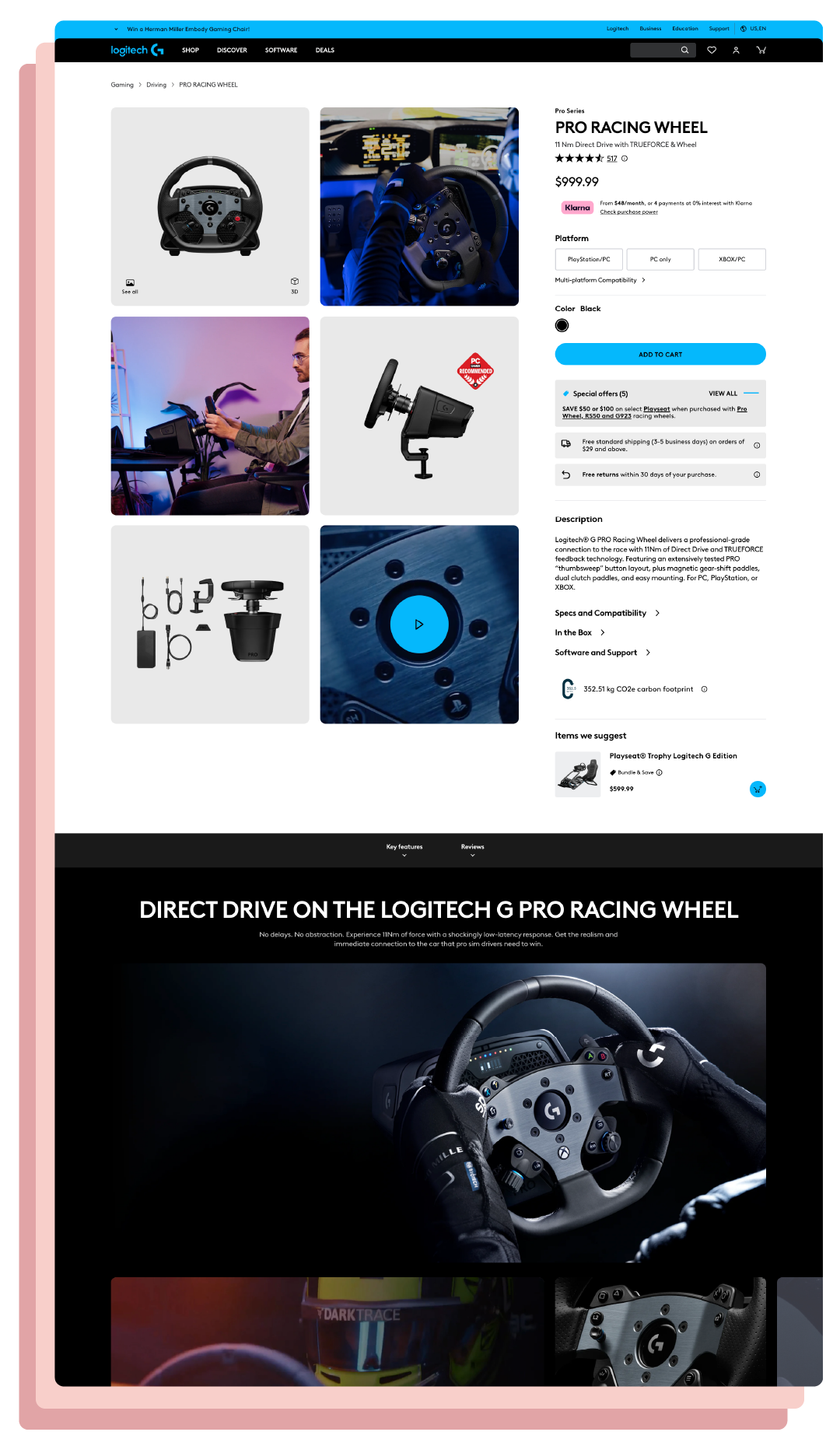
You could not see the whole system, compatibility was an afterthought, and necessary accessories could be easily missed.
Constraints
No 3D Product Pipeline Existed for Web
Logitech had never rendered products at this fidelity for the web. No pipeline, no asset standard, and no answer for how heavy a scene could get before the page stopped being worth visiting. The configurator could not exist until that was solved.
1.
Discount angle was blocked by MOR Functionality
Sale pricing didn’t hit until the cart, so there wss no way to sell a “bundle and save” value proposition for this collection unless a user was willing to commit, which of course they would not know or notice.
2.
We only had a fews months to get this done
As is common in the tech space, we had a very short timeline to get this done, a few months max before it had to live, so no room for mistakes.
3.
02 — SOLUTION
V1 / The Bundle
The seemingly obvious solution to a multi-page problem is a bundle. Simply allow the products to be purchased as a group, and problem solved. This first pass lived inside the existing product-page template as a bundle-and-save module: a contained card, a checkbox list of parts, a generic desk scene, a running subtotal.
But the idea didn’t hold up in court. “Bundle” framed the page as a discount mechanic, so every question became “what do I save?” instead of “what am I building?”
V2 / The Driving Experience
Renaming it was the actual design move. The title states an outcome, so each choice reads as a part of something rather than an item in a basket. The experience became its own page and cart-filling became assembly.
Rig / Desktop was a view toggle on the image, not a choice that changed what you could buy. The interface was implying a decision it did not actually honor. And checkbox rows returned below the fold, so the page contradicted its own first step.
V3 / The Standalone Configurator
The sequence. Platform → Base → Wheel Rim → Steering Hub → Steering Wheel → Pedals → Shifter & Handbrakes → Accessories → Finish. It follows assembly order, so every step has an answer to “why am I being asked this now?”
Required and optional parts split into labelled groups. “Optional Add-Ons” is a heading, so skipping is a legible choice.
The Finish block closes properly: line items with live stock state (in stock, back-order, pre-order), promo tiles, subtotal with savings, and a sticky buy bar that follows you down.
Progress dots on the right edge, because the rail is honestly long.
03 — ART DIRECTION
Directing a 3D pipeline that did not exist yet
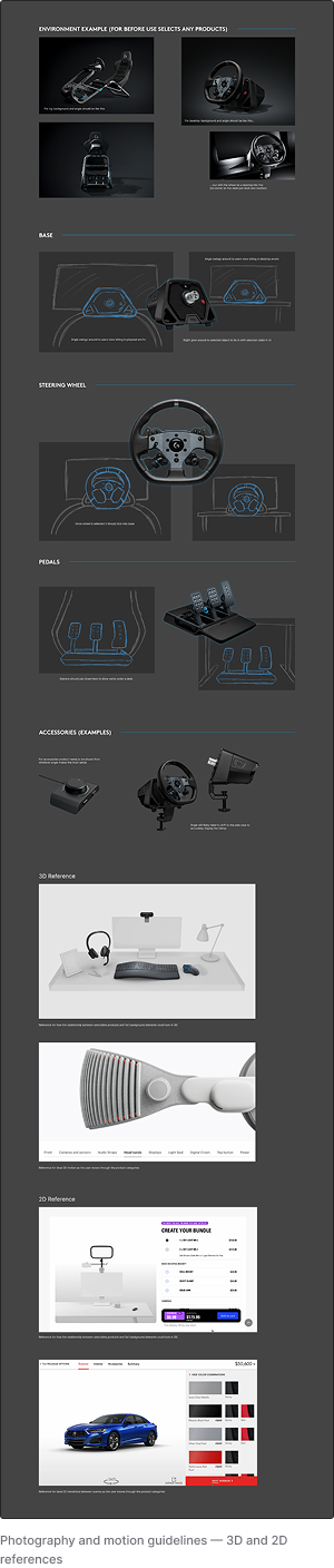
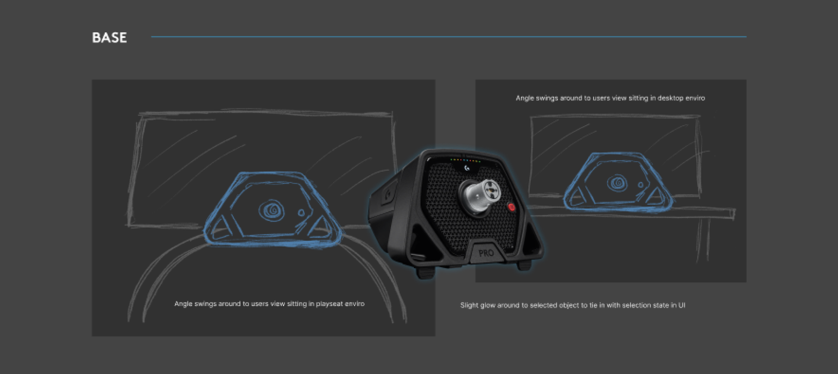
The renders were produced by an external 3D agency. My part was upstream and alongside: I drew the initial direction, wrote the shot rules, and reviewed every pass of the build. The harder question underneath it was budgetary — how much fidelity the page could carry before load time made the whole experience pointless.
04 — RESULTS
What happened when it shipped
First month post-launch, measured against standard product pages and against the site as a whole. It is still live today — restyled since, on the same underlying structure.
2.61 vs 1.56
Units per order was the real test
The premise was that people could not assemble a complete system across nine pages. Order composition tests that directly, and it moved 67%. Top cart additions were exactly the dependency chain the page teaches — Pro DD11 wheel base, RS wheel hub, Pro racing pedals.
$421 vs $196
Order value more than doubled
+120% against product pages and +112% against the site average. Not because more people bought, but because the people who bought bought a working setup instead of one part of one.
1m30s · 45% ATC
Engagement supports the comprehension claim
Time on page +50%, add-to-cart 45% against 14%, CTA engagement 15.4 against 5.1. People stayed, worked through it, and finished — which is what you would expect if the page was doing explanatory work rather than just listing.
05 — LEARNINGS
What I would do differently
📱
Design mobile first, not mobile also
Mobile was an afterthought, and it shows. The mobile experience is just the desktop one moved around. Ideally mobile should’ve gotten an experience that gave some benefit to using a phone (like AR) to avoid making it feel like the user was missing out.
🏎️
Lean more into the racing experience
Ultimately this experience was inspired by automotive builder tools (think Porsche / Audi / etc.) and while it nailed the UI the overall luxurious aspirational driving vibe could’ve been pushed further.
💰
Less shot list exploration, more function
A lot of functionality was left on the table. To really push conversion, we should add a way to show sale pricing and benefit props to tilt more people out of consideration and into purchase-ready.